ROLE
I worked with the Center's new leadership to design a full suite of new outreach materials.
SERVICES
Print design
The challenge
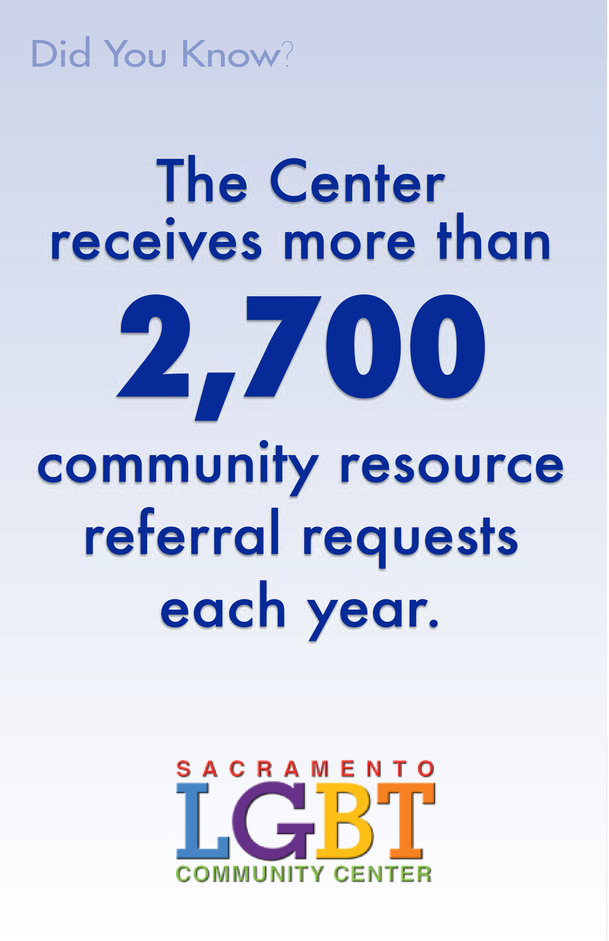
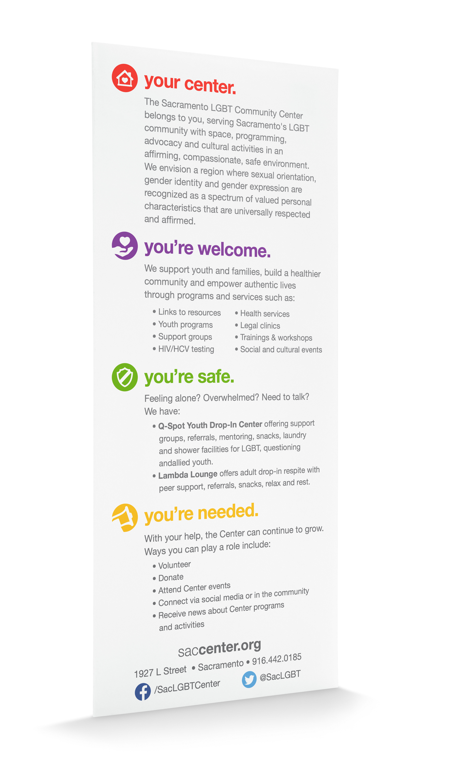
Sacramento’s LGBT Community Center had recently hired new leadership and wanted to streamline their look and feel and create a cohesive message during outreach at community events. The Center had also recently focused its attention on youth and health outreach and needed to more effectively communicate with these targeted populations and recruit volunteers.
The process
Materials up until this point had been created by a slate of committed volunteers, but turnover in participation had created a fragmented look over time.
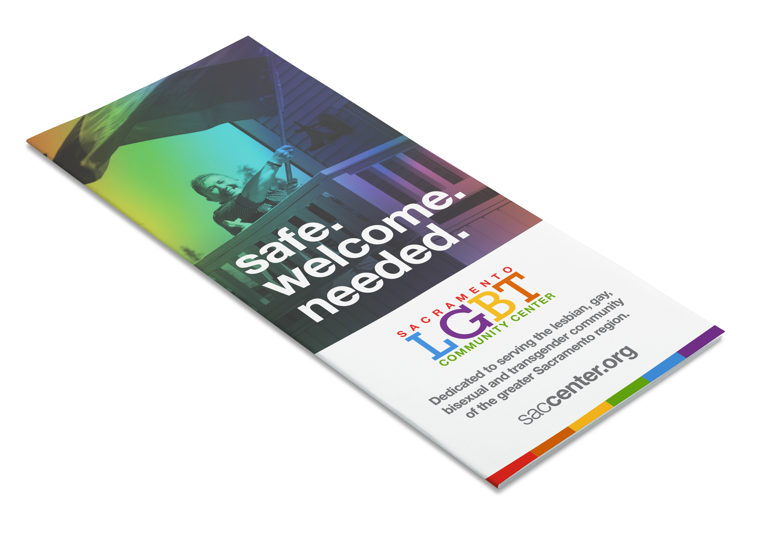
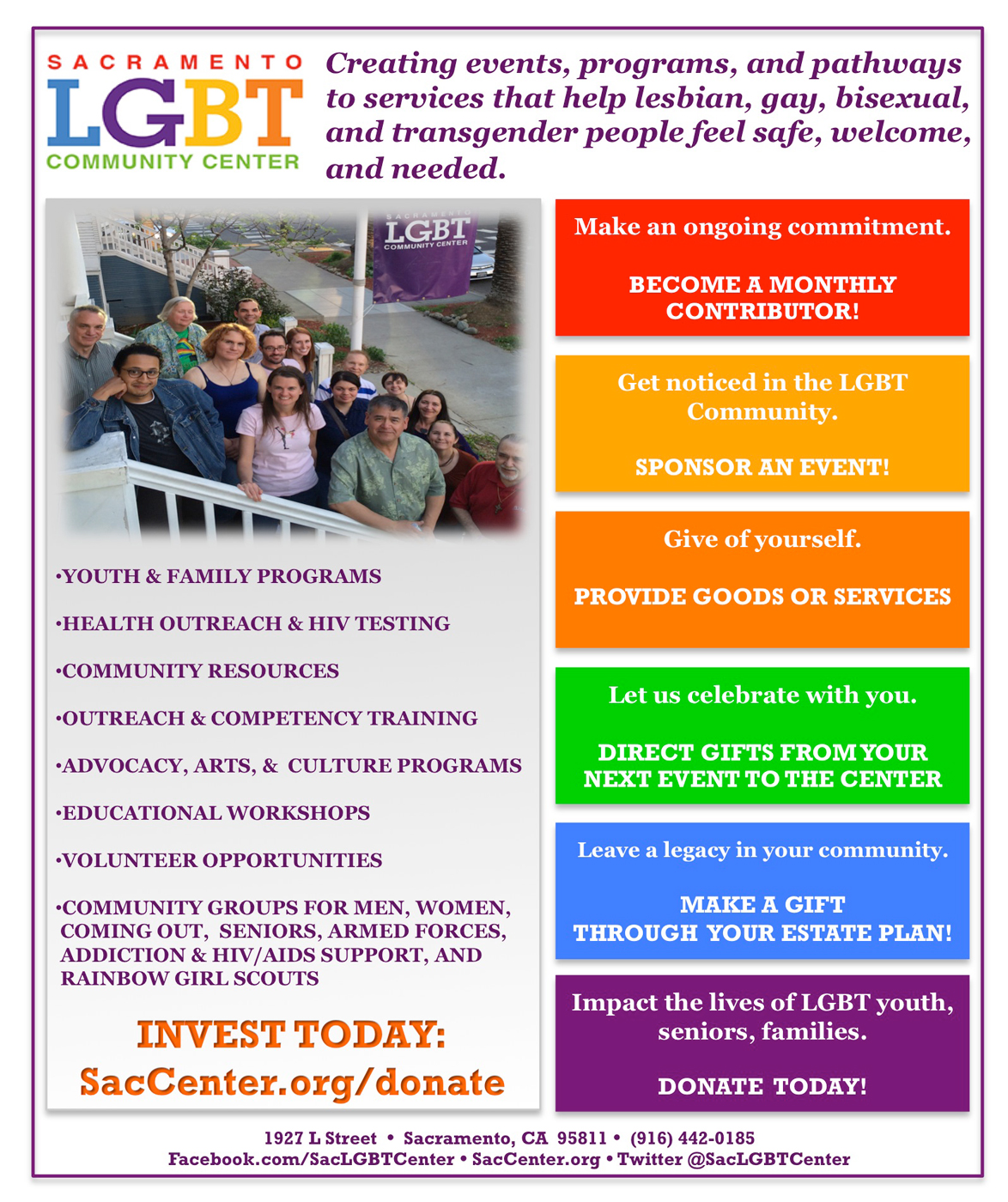
The first step was to establish a consistent treatment across all the new collateral. A clear hierarchy of information and modern typography give the Center an easily approachable look. A simple band of six colors from the rainbow flag anchors each piece along the bottom edge.
A colorful system of icons, borrowing from the brand’s existing palette and rainbow flag, represent key services of the community center, such as support groups and volunteer opportunities.
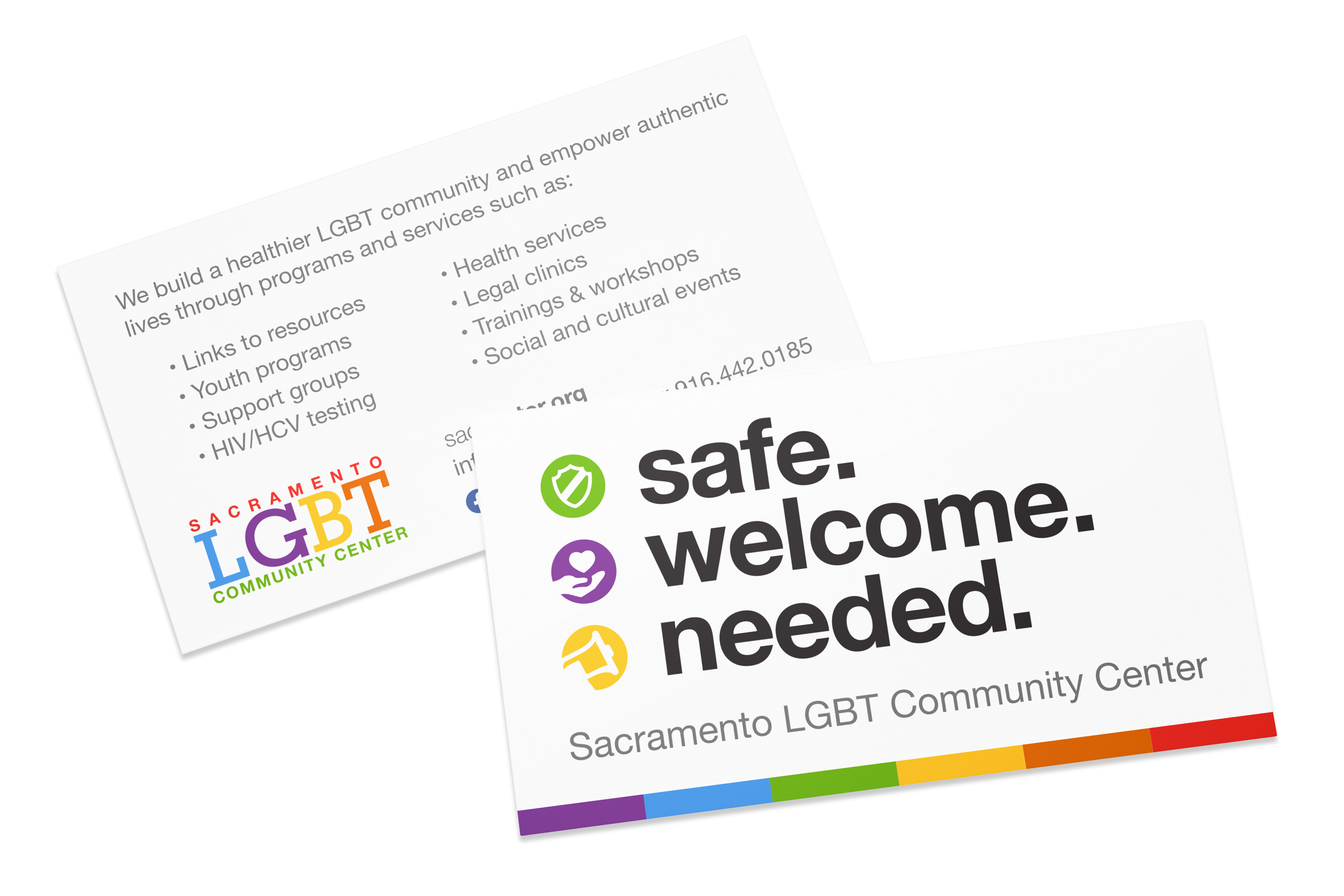
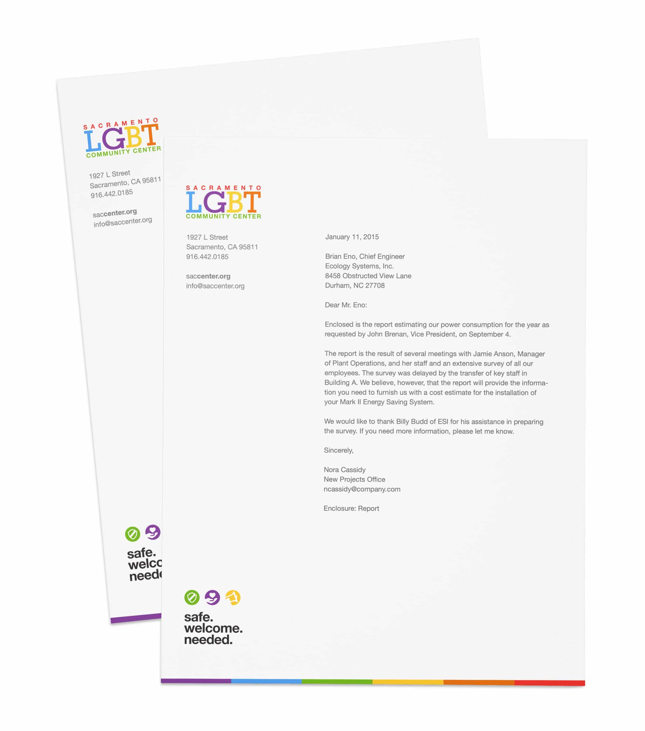
This simple design motif was replicated across all collateral including a complete set of stationery for the Center's staff.
cover photo by ROBIN WORRALL on Unsplash