Grow Apprenticeship California
Launching a new initiative to help expand an important way of learning new skills and share best practices along the way.
ROLE
I led the creative development as the organization renewed its focus on support for apprenticeship programs statewide.
SERVICES
Brand identity design
TEAM
Communications strategy: Sarah London
Project manager: Lindsay McHugh
Designer: John Pastor
The challenge
California has the largest apprenticeship system in the country and many programs connect with the state's 116 community colleges. The Foundation for California Community Colleges was looking to expand its support for apprenticeship programs statewide and reposition themselves as a resource in helping to expand apprenticeship in new and innovative sectors, and acting as thought-partners with the traditional building trade apprenticeship programs.
The process
Our in-house communications team developed a strategy that conveyed a unified message: that the apprenticeship support team at the Foundation provides a broad set of resources for colleges, employers, and students.
Initial concepts I created were focused on growth, the technical nature of apprenticeships, and a symbol of growth — the official state flower of California — the golden poppy.


During the refinement process, the team landed on a new name, and a goal in itself: Grow Apprenticeship California.
Grow Apprenticeship California provides quality technical assistance, hosts professional learning events, and develops a community of practice with the goal of equipping programs and employers with the tools needed to create strong and sustainable apprenticeship programs.
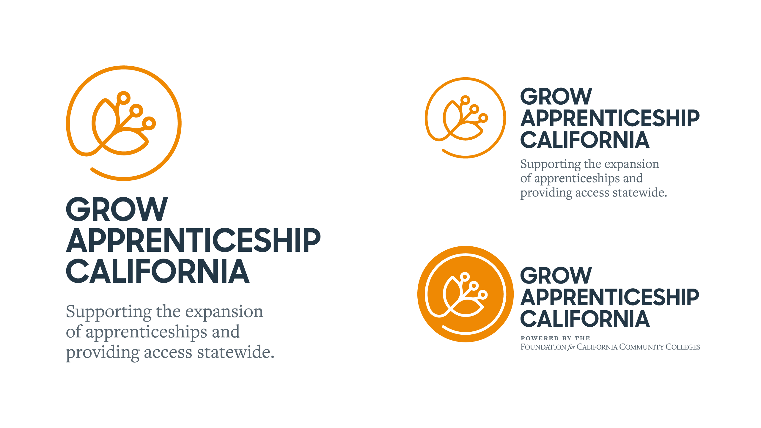
The final stylized poppy logo pays homage to the official state flower of California and to the geometric nature of schematics, symbolizing growth and upward mobility, while also merging the technical and organic nature of the apprenticeship sectors the program aims to support.


The duality of the visual language is also woven through the color palette and typography. A bright poppy gold contrasts with a professional slate grey color and the sleek Sharp Sans typeface is paired with Freight Text, adding a warm touch to the brand identity.


The result
Grow Apprenticeship California is already hard at work helping bring awareness to new and innovative apprenticeship sectors and increasing the number of apprenticeships statewide as a result. And the program team has already hosted nearly a dozen webinars—highlighting topics from equity to data and program management.

Poppy photo by Ehimetalor Akhere Unuabona on Unsplash