ROLE
Using the redesigned wireframes from ideas42, I designed a prototype application displaying the potential of a new common application.
SERVICES
UX / UI design
TEAM
Behavioral science consultants: ideas42
Creative director: Bryan Miller
Project manager: Emily Gerofsky
Designer: John Pastor
The challenge
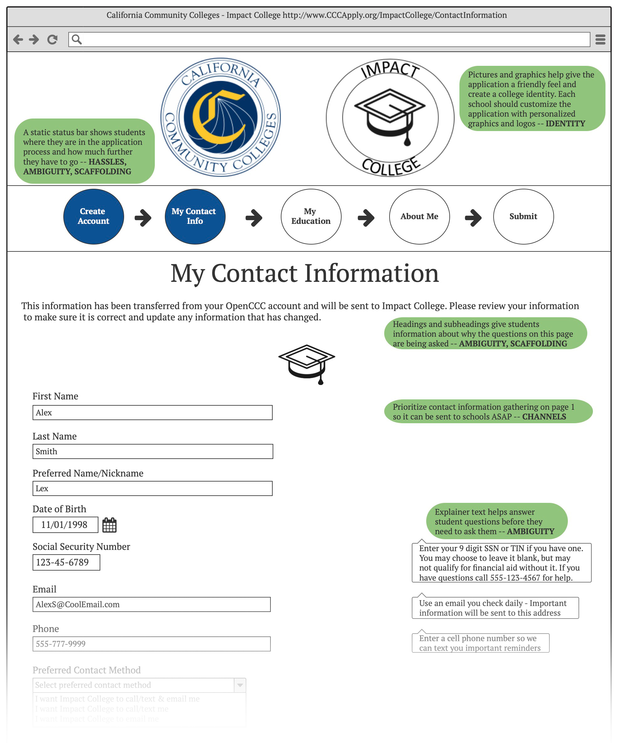
The Foundation for California Community Colleges partnered with behavioral science experts ideas42 to take a deeper look at barriers that impact students’ progress during matriculation and goal setting, focusing on the CCCApply common application.
ideas42 developed a series of recommendations and wireframes informed by this research and the in-house design team at the Foundation worked to create a design for a refreshed application.
The process
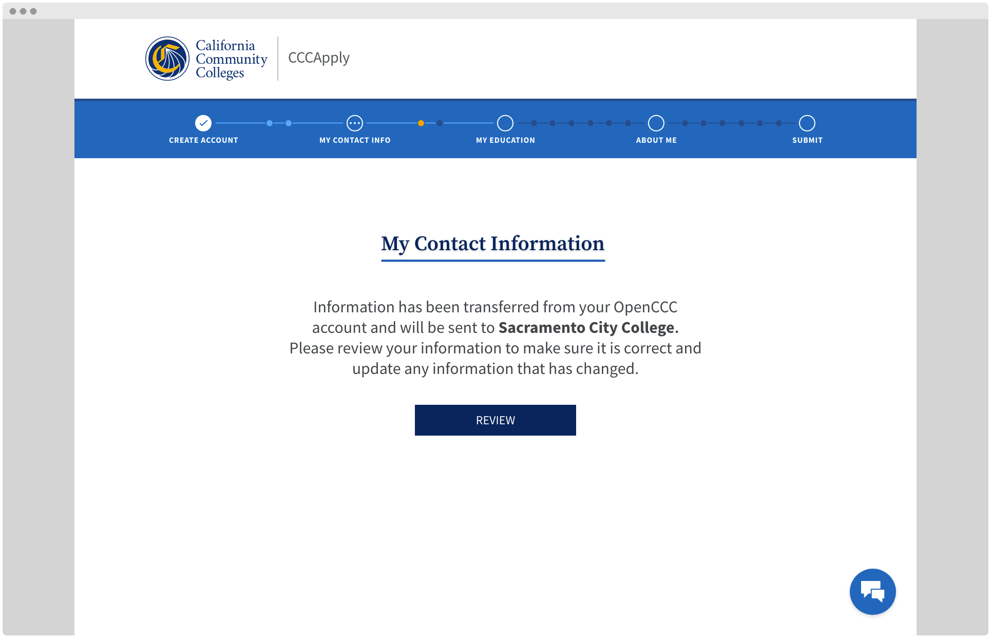
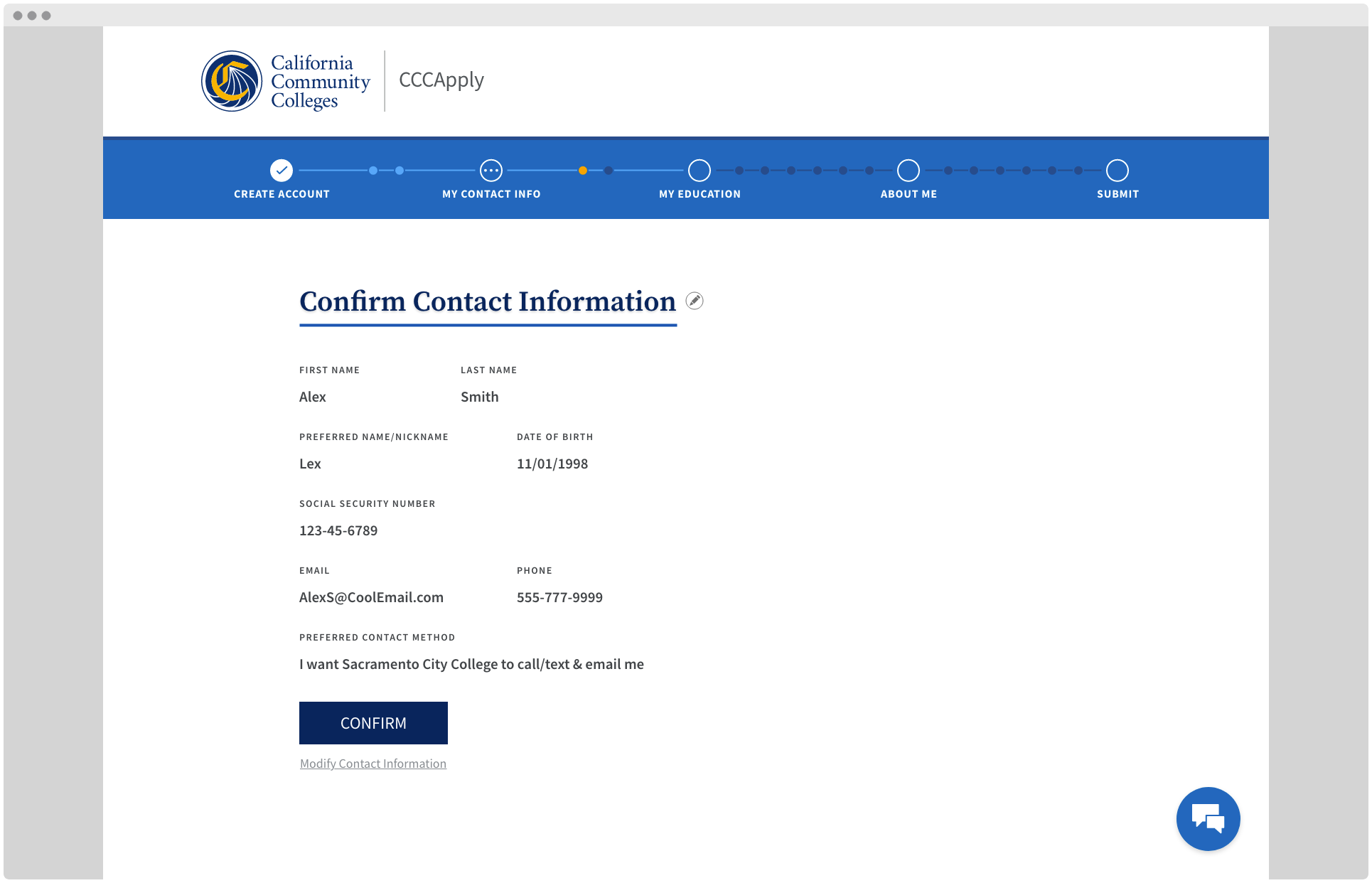
The wireframes served as a guide for the refreshed concept. We started by breaking down the process into simple screens that wouldn’t overwhelm prospective students. A status bar at the top reminds students where they are in the application process, adding a clear indication how much is left to complete and potentially keeping more students in the application.
The process begins with the student’s contact information transferred from the system’s single sign-on platform, OpenCCC, and informs the student that their information will be sent to their prospective college.

Once the student has confirmed their contact information, the application’s look and feel updates to reflect the prospective college’s branding, while also staying aligned with systemwide branding efforts.
Colleges within the system can upload relevant photography from their campus, giving the application a friendly feeling and the student a sense of belonging.
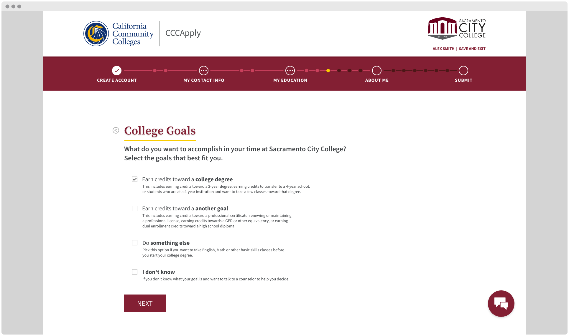
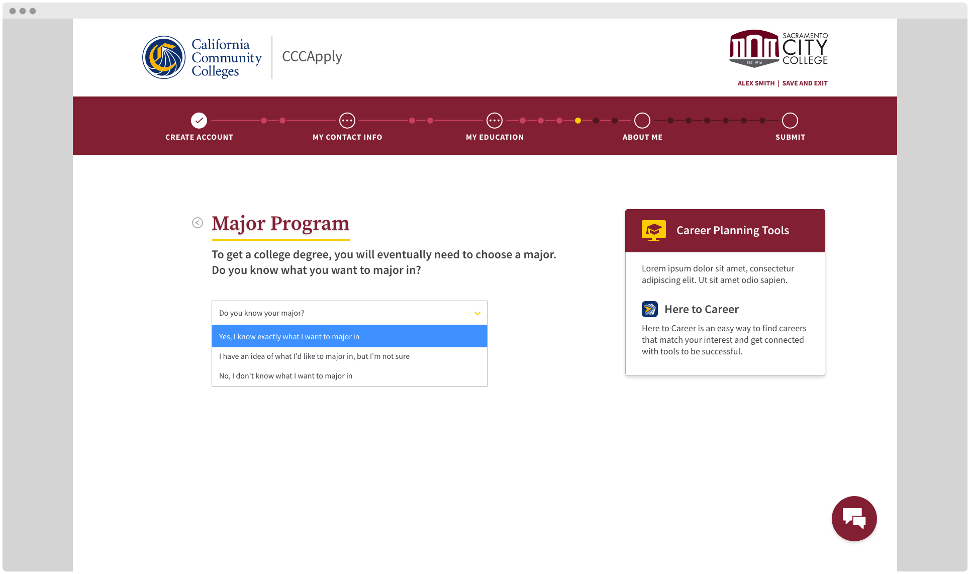
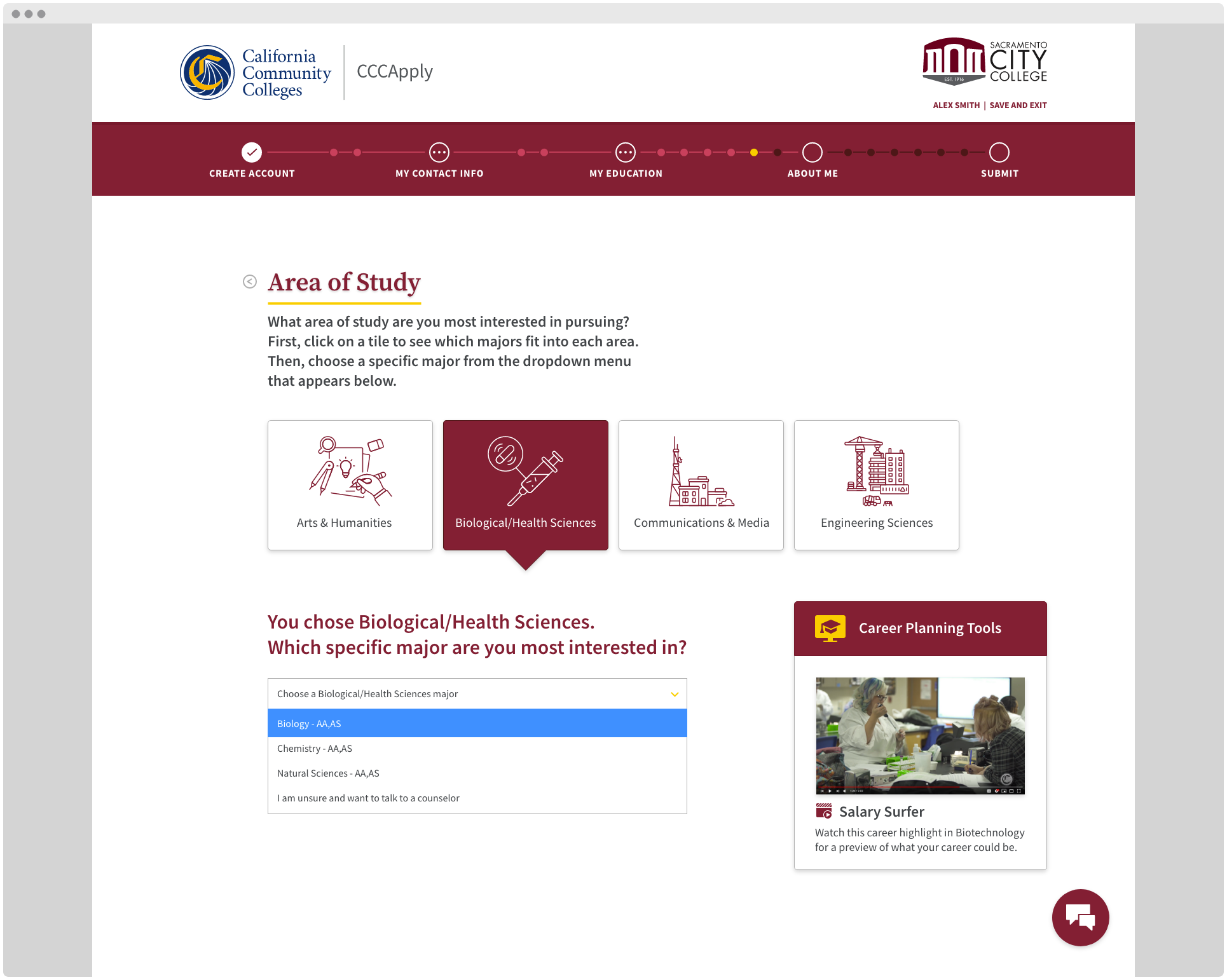
Each section of the application provides context behind the information students are being asked to provide and helpful tips are available as the student completes each field, anticipating frequently asked questions.
The result
This prototype only scratches the surface of the recommendations ideas42 put forth in their reporting and while the system has not yet developed this into a full working application, design principles stemming from this process have been championed across several levels of communications and technology development.
